This position was a contract that covered several music Festivals such as RBC Ottawa Bluesfest, CityFolk Festival, Marvest Music Festival and other smaller festivals.
Quick Links to
Some images may be available to view larger or as a PDF by clicking on them.
Bluesfest
Site Map
The very first project I was tasked with when I started at Bluesfest, was to redesign the festival site map and update where the fences, stages, vendors etc. are located.
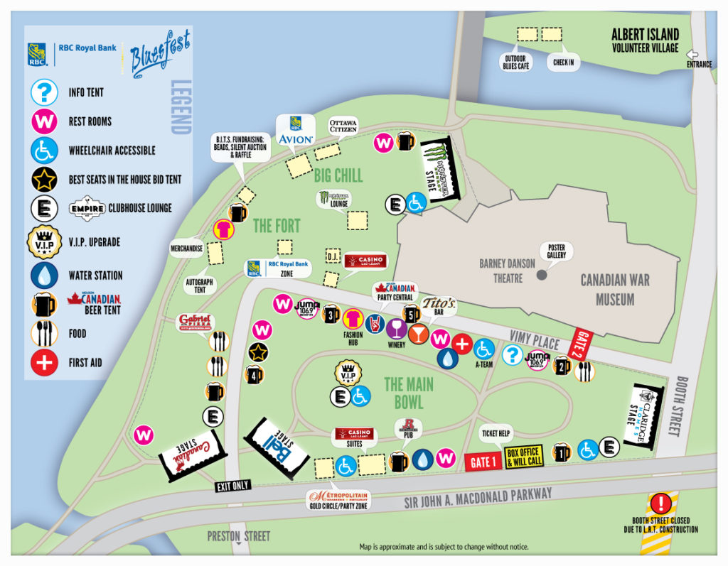
The Operations and Marketing Managers were delightfully surprised to see the quality of the map as well as getting it produced in a timely manner that exceeded their expectations.
Program Guide
I was asked to improve the design of the previous years’ program guide and map for Bluesfest. The layout called for four folds to be small enough to fit in a pocket or purse.
With my experience, I could see that the design could be made cleaner and easier to read. While retaining the overall marquee theme used across all 2015 Bluesfest marketing materials, I used typography and a lighter colour scheme with shading to help to achieve my goal. I improved the accuracy of the festival site map and simplified the detail only to show the important locations with fun icons.
In the end, I was given a lot of positive feedback with the new program guide and map.
Directly below is the front and back of the folded up program guide.
Daily Grid
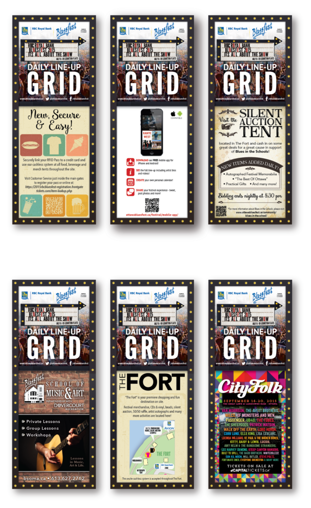

These print pieces were distributed daily during the festival because of last-minute changes to the schedule. Working to a very tight deadline, I made any final changes and sent each one to the printer the day before. Using the marquee theme, I designed the overall look for the daily grid and the small advertisement pieces that changed day-to-day. The reverse side maintained the look of the larger program guide schedule.
Both patrons and my colleagues commented on how much they liked it because they were nicely designed, very easy to read and it had all the information they needed.
Back to Top
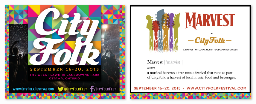
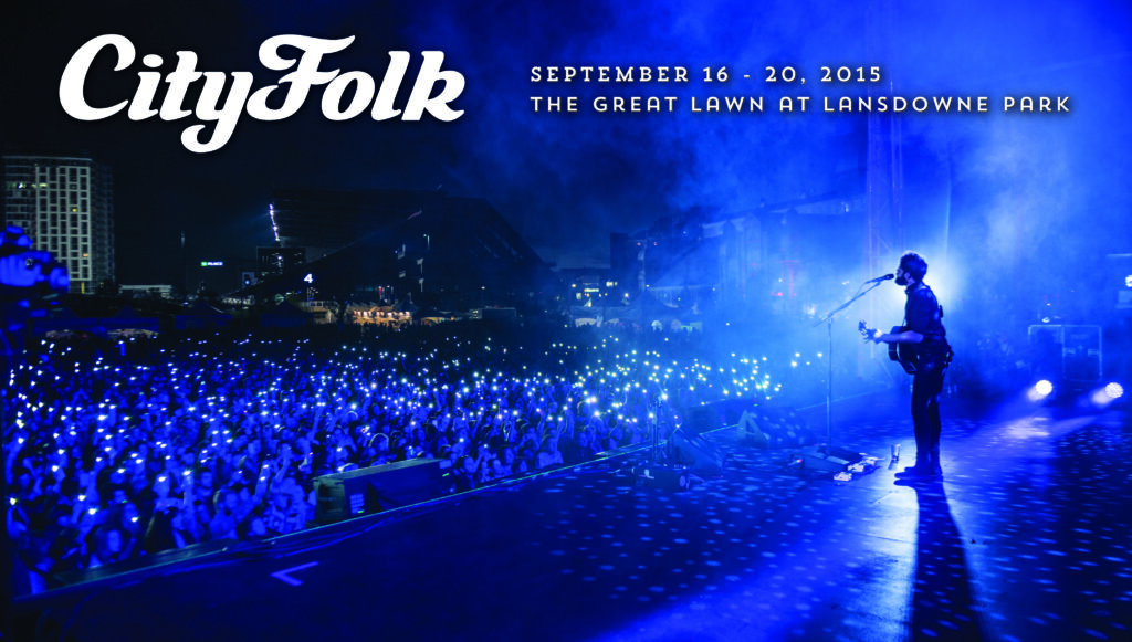
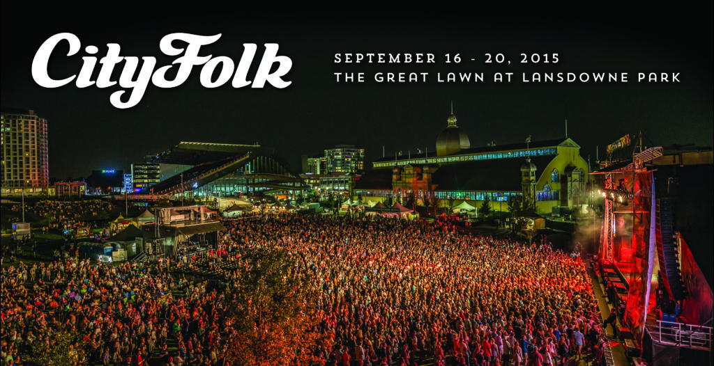
CityFolk Festival
The theme for CityFolk 2015 was a quilt pattern and multicoloured text reflected in my design samples below. The branding appeared on everything from posters and signage to the car deco wrap on the Folk Wagon.
Site Map

There were many firsts for CityFolk in 2015, including a new name – and because it was the first year that CityFolk would be held in Lansdowne Park, I knew the map was going to need last-minute changes once the equipment and vendors arrived on site. Being prepared was key, so, before the event, as soon as my supervisor returned from a visit to Lansdowne, I quizzed him for updates and immediately changed the map.
Program Guide
After designing the program guide for Bluesfest, my manager decided to have me design the CityFolk program. The program included the two stages in CityFolk and the 14 Marvest venues. Using the colour coding idea I had with the tourism brochure, it made sense to carry it through to the program guide. It wasn’t easy to get everything to fit, but I was confident I could do it.
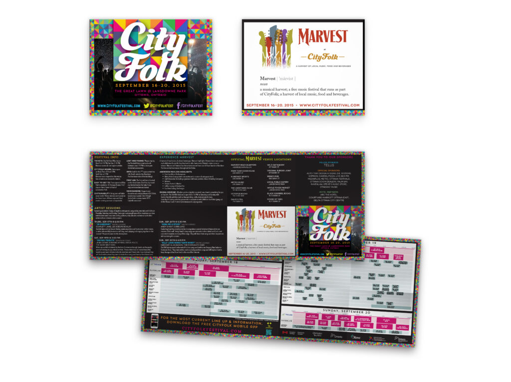
Directly below is the front and back of the folded up program guide.
Daily Grid

I designed the daily grid for CityFolk and Marvest. The CityFolk front ad space was sold to Warner or used for other promotions, but Marvest was able to include the map I designed, which added to its convenience.
Volunteer T-Shirts

Following the CityFolk multi-coloured quilt theme, I designed and paired the shirt material and ink colours. The final result was great to see at the festival.
CityFolk Promotional Posters
Immediately post-festival, I was asked to design some posters using some photographs taken during the event. The Executive Director loved these the most and used them to promote the festival in 2016.
Back to Top
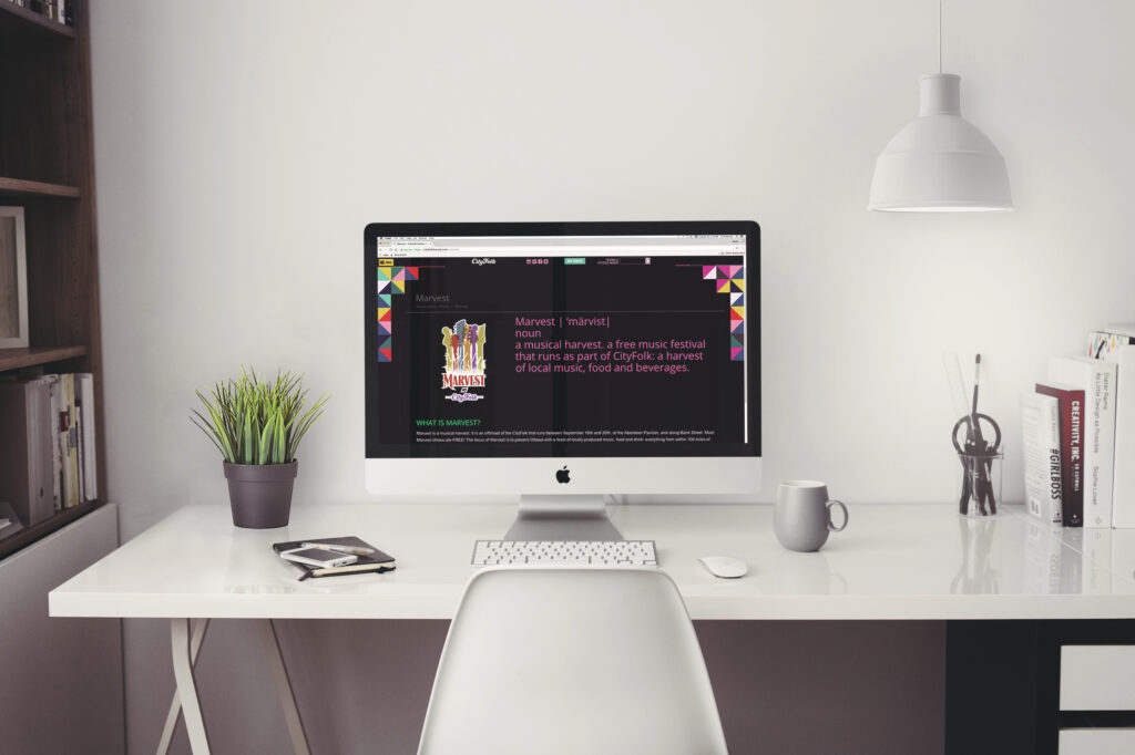
Marvest Festival
I know what you’re thinking because that’s the first question I asked when I heard the name as well. “What is ‘Marvest’?”.
After learning what Marvest was, I came up with an idea to help with the marketing and branding of the festival using an explanation so the public could quickly learn about it. The design and concept I proposed could be used throughout the marketing materials and the website. I presented my idea to the marketing director, who loved it, and it ended up being a beneficial tool when anyone asked “What is ‘Marvest’?”.


The Canada 150 Festival Express
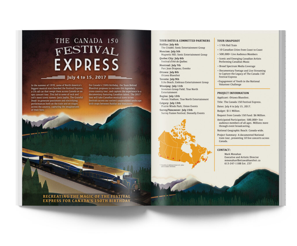
I designed this leave behind piece for the executive director of Bluesfest, Mark Monahan. He had put together a plan to resurrect the Festival Express that originally took place in 1970. Mark had the idea that it would take place in 2017 to celebrate Canada’s 150th birthday. When I designed this piece, it was still in the early planning stages, so there wasn’t a logo, theme or campaign created for it yet. It was up to me to come up with an initial look.
I selected contrasting typefaces from the railroad era and a classic poster image to give it a reinvented feel, rather than copy the original art nouveau look that was popular throughout the ’70s. The idea was to be a retro-modern twist on the original train tour.